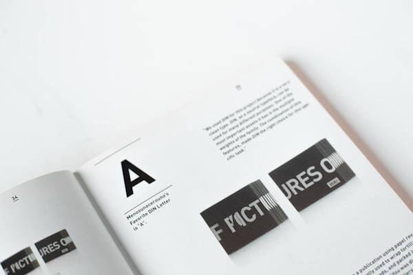
Inset
Applies a negative margin to allow content to bleed into the surrounding container.
<Card size="2" style={{ maxWidth: 240 }}>
  <Inset clip="padding-box" side="top" pb="current">
    <img
      src="https://images.unsplash.com/photo-1617050318658-a9a3175e34cb?ixlib=rb-4.0.3&ixid=M3wxMjA3fDB8MHxwaG90by1wYWdlfHx8fGVufDB8fHx8fA%3D%3D&auto=format&fit=crop&w=600&q=80"
      alt="Bold typography"
      style={{
        display: 'block',
        objectFit: 'cover',
        width: '100%',
        height: 140,
        backgroundColor: 'var(--gray-5)',
      }}
    />
  </Inset>
  <Text as="p" size="3">
    <Strong>Typography</Strong> is the art and technique of arranging type to
    make written language legible, readable and appealing when displayed.
  </Text>
</Card>
API Reference
This component is based on the div element and supports common margin props.
PreviousIcon Button
NextPopover
